
Instructions
things were made to simplify
Classes — 01
Classes are named according to what they are or what they do — headings and paragraphs/texts have different sizes, so their classes are like this:
Classes — 02
Class names describe the sections and their inner elements as much as possible, usually relating the children with their top parents — the section is the top parent.
Classes — 03
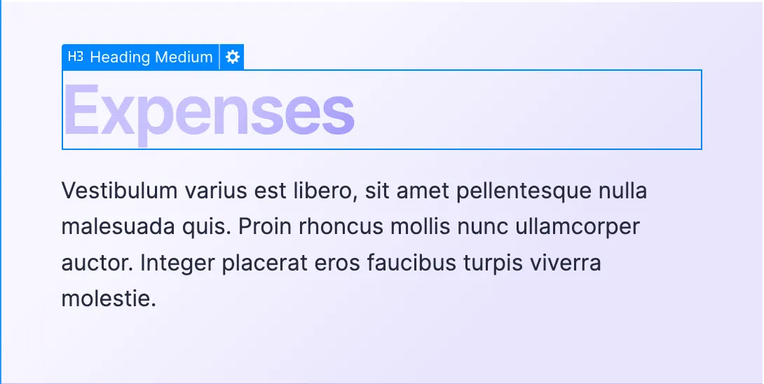
Combo classes are used when an element requires a different styling from its initial — a heading set with the class "Heading Medium" needs a blending effect called "color burn".
In this case, the heading would get the following classes:
Note: The prefix "Is" — like in "Is Color Burn" is used when the additional class forms with the initial class a combo that could potentially be used on other parts of the website.
.png)
Classes — 04
Besides the prefix "Is", the additional class can also get the prefix "For" — the "For" is used the the additional class does something that is specific to that element.
We use many title wrappers to control the max-width of a heading. The class "Title Wrapper" has no styling at all, so we add a second class with the "For" if the heading in particular needs special treatment.
.png)
.png)
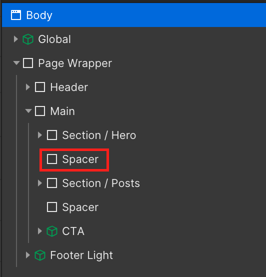
Spacer
Spacers are used only between sections — the spacer is an element that sets the vertical spacing. They can get an additional class when the spacing between the sections in question requires some special treatment.
The additional class gets the prefix "before" or "after".
.png)